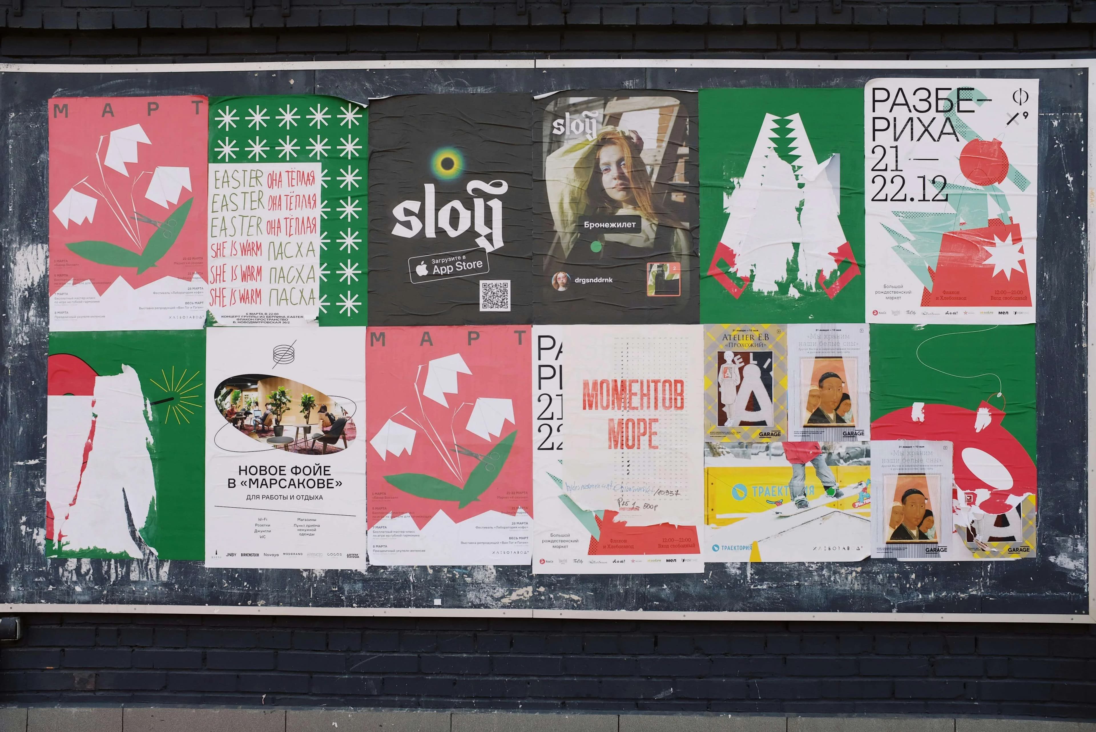
Why Poster Design Matters on Social Media
On platforms like Instagram, Facebook, LinkedIn, and X (Twitter), you have roughly 1.5 seconds to capture attention before a user scrolls past your content. Exceptional poster design isn't just about aesthetics โ it's about survival in a noisy digital landscape. The difference between a forgettable post and a viral one often comes down to visual execution.
10 Essential Tips for Social Media Poster Perfection
1. Lead with a Clear Visual Hierarchy
Every great poster has a clear hierarchy: the eye moves naturally from the most important element to the supporting details. Use size, color, and placement to guide the viewer's gaze. Your main message should be unmissable at a glance.
2. Choose Fonts That Communicate Your Brand Personality
Typography is a voice. Bold, condensed typefaces communicate urgency and energy. Elegant serifs suggest tradition and quality. Clean sans-serifs project modernity and openness. Match your font choice to the emotion you want to evoke, and never use more than 2-3 font families in a single design.
3. Use Color Psychology Strategically
Colors trigger emotional responses. Blue builds trust and calm. Red creates urgency. Green suggests growth and health. Yellow grabs attention and signals optimism. Rather than choosing colors randomly, research what resonates with your target audience and align your palette accordingly.
4. Embrace Whitespace
Crowded designs overwhelm the viewer. Give your content room to breathe. Whitespace isn't wasted space โ it's a design element that creates focus, elegance, and clarity.
5. Optimize for Each Platform's Dimensions
Instagram feed posts: 1080ร1080px. Stories: 1080ร1920px. LinkedIn: 1200ร628px. Not optimizing for platform-specific dimensions means your design will be cropped or stretched โ an instant credibility killer.
6. Make Your CTA Unmissable
If your poster has a call-to-action โ "Shop Now," "Learn More," "Register Today" โ ensure it stands out with high contrast, a button shape, or clear directional arrows. The CTA should be the second thing the eye lands on, right after the headline.
7. Use High-Quality Imagery
Blurry, pixelated, or generic stock photos destroy credibility. Use crisp, relevant imagery that actually relates to your message. AI-generated visuals are becoming a powerful alternative to stock photography, offering unique images tailored to your exact content.
8. Stay On Brand, Always
Consistency across posts builds brand recognition. Maintain consistent use of your logo, colors, fonts, and overall visual style. When someone sees your post, they should instantly recognize it as yours before reading a single word.
9. Test with Mobile First
The vast majority of social media is consumed on mobile devices. Design for the smallest screen first, then scale up. Text needs to be legible at thumbnail size. Important elements should not be near the edges where interface chrome might obscure them.
10. Iterate Quickly with AI
The old design process was slow and expensive. With AI tools like PosterAI, you can generate multiple design variations from a single description and quickly identify which direction resonates best โ before spending any time on detailed refinement. Think of AI as your rapid ideation partner.
Your Next Poster, Powered by AI
Implementing all 10 of these principles traditionally requires deep design training and hours of work. PosterAI builds these principles into its generation process, helping anyone create stunning, professional social media posters from a simple description. Start your first design for free today.

